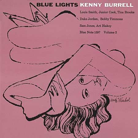
Before he became the king of pop art, Pittsburgh native
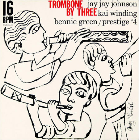
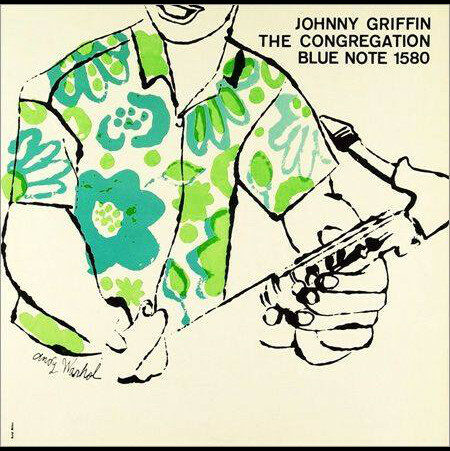
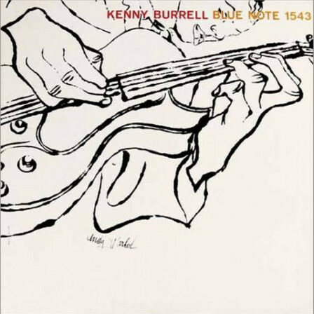
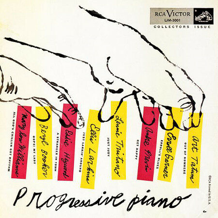
Andy Warhol moved to New York to make it. Warhol wanted to be part of the elite strata inhabited by Gore Vidal, Truman Capote, Tennessee Williams and other sanctioned artists. He didn’t have what it took to be admitted to those circles but he did have drawing ability. Warhol worked as an illustrator, drawing shoe and purse advertisements for newspapers, or anything that came his way. Eventually he oversaw one of the busiest graphic design offices in New York, and along the way he turned out some album covers. His pen and ink sketches were rendered in a light, floating, linear style that had antecedents in Ben Shahn and David Stone Martin.
Not all of the Warhol covers were jazz subjects, and not all of them were great. As his Pop activities caught fire in the early 1960s, he moved away from the album covers; he would, of course pick it up again in the late ’60s, using photographic techniques. He didn’t appear to have much of an affinity toward jazz, but his covers are fun to look at, nonetheless. At his best, he imparted a light-hearted tone and a lyrical grace to them. His last Old Testament album cover was his best: Kenny Burrell’s “Blue Lights” for Blue Note.
Kirk Silsbee publishes promiscuously on rock, jazz and the visual arts. He has been an artsmeme contributor for five years.

