Who knew? When we were high school kids in suburban Pittsburgh in 1972, devouring the images on the cover of The Rolling Stones’s unspeakably great double album, “Exile on Main Street,” who knew that 39 years later, in a Los Angeles art gallery, I’d have a nice chat with the graphic artist who created the iconic, design-intensive album cover?
Like, who knew that?
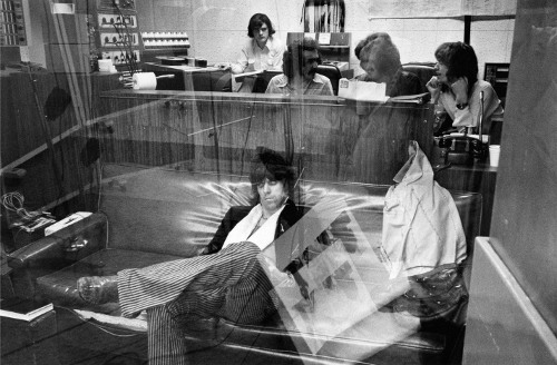
Just one week after meeting John Van Hamersveld at Gregory Way, I visited his new photography show, “T.V. LIFE.” There, confronting a photo (posted above) of a Rolling Stones sound-mixing session, I learned that Van Hamersveld executed “Exile”‘s intricate and weird design, an eye-grabbing montage of collage art accented in semi-putrid green and purple. In 1972, my assumption about the disturbingly freaky images was that they were the work of a Brit — you know how eccentric they are.
But the designer is a guy straight outta of southern California; Van Hamersveld, his other claim to fame key art from the film “The Endless Summer.” And he’s a very nice person. Apropos “Exile on Main Street,” I learned that the . . .
- cover design features the photography of Robert Frank, who Van Hamersveld reveres and whom he brought onto the job
- use of Frank’s freaks and carnie folk imagery stemmed from the Stones’s self-view as a side show in the circus world of rock ‘n roll.
- text was the handwriting of Mick Jagger, whom Van Hamersveld calls “Jagger”
- album’s “exile” theme was based on the situation the band perceived itself in after a financial rift with manager Allen Klein
- title, originally just “Exile,” morphed to “Exile on Main Street” after a photo shoot with Frank and the band in downtown L.A.’s Main Street. Yes, that Main Street.
- presence in the studio of Marshall Chess, son of the founder of Chess Records whose old man had recorded Muddy Waters and Howlin’ Wolf, had a big influence on the bluesy sound tracks in the album
- good telling of the design saga is here.
All of this data I grappled with as Van Hamersveld toured me through the excellent “T.V. Life.” The photography show, staged in conjunction with the publishing of a book of the same name, hangs in a cool, deep, rectangular Koreatown art gallery. It’s a magical mystery tour (oh, Van Hamersveld designed that cover, too) of Los Angeles pop ‘n art culture of the late ’60s and early ’70s. Recommended.
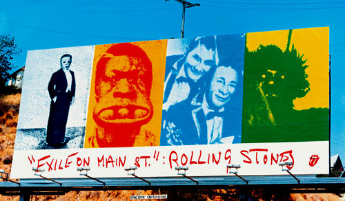
One other tidbit. Van Hamersveld’s shot of the Stones includes some art work in the window’s reflection. Those would be sketches for a huge Sunset Boulevard billboard Van Hamersveld designed for the album. Turned out like this:

John Van Hamersveld | ‘T.V.LIFE‘ | Perfect Exposure Gallery
Photo from ‘T.V.LIFE’ exhibit Mixing Exile on Main St. at Sunset Sound, 1972 Credit: Courtesy of John Van Hamersveld/ Copyright John Van Hamersveld


Hi,
I thoughly enjoyed this. I am currently reading Keith Richards’ “Life” and have been a longtime Stones fan and collector (You should check out the non-Warhol, Euro cover for “Sticky Finger”! It’s pretty cool too.)
I always find it interesting to discover the how and why and where in the development of art and music. This article fills in some of the gaps (not really gaps, but adds to the completeness) in conjunction with that fine album.
Thanks!
Glenn