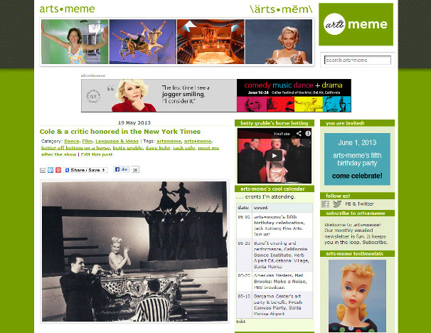
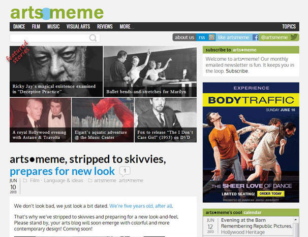
We hope our new design enhances your experience reading about arts and opinion at https://artsmeme.com. New features include:
- cleaner, cooler more contemporary look!
- “chiclet” navigator of top five featured stories.
- category menu allows direct access to the story scroll sorted by your favorite subject area, dance, film, music and the like
- full scroll displays the full text of the three most recent stories, followed by time-sorted excerpts, each highlighted with a dramatic full-column-wide image. If an image or excerpt grabs your attention, click to read the full story
- quick keyword search without typing … click “Topics” in the black menu bar for a list of common keywords.
- social media quick connection at page top and bottom
- larger fonts, dramatic use of imagery, wider columns — all selected with readability in mind.
Check out arts•meme. Come often. Invite your friends! Enjoy. Stay awhile!
Subscribe to our newsletter here.


We love getting these meme-orable comments. Thank you, all!
from: Your Editor
Dear Ms. Meme: I like your new and exciting look. Sincerely, Mike Hawks (U.S. Army retired)
A great new look. Really fun and readable. I love the big LEAVE A REPLY button. I look forward to reading a lot of them.